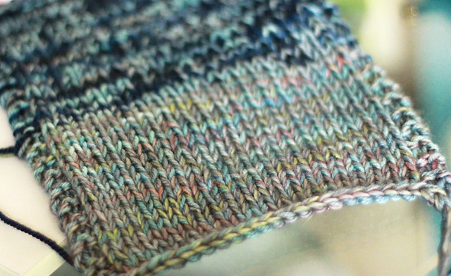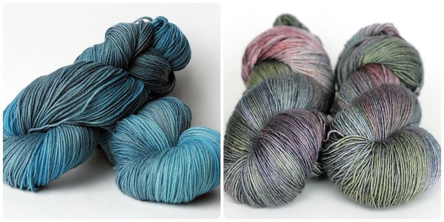
Did I mention last week that I had swatched for my Oshima? Well, I did. I grabbed a few skeins of yarn and started knitting. The top of this swatch (that blurry splotchy section) was knit using 1 strand of Blue Label sock yarn and 1 strand of Purple Label Cashmere sock yarn, disregard that section please. That was my original plan for this sweater, I thought that cashmere would be a nice touch. Then I decided to up the anti and try swatching with 1 strand of Blue Label and 1 strand of Red Label Cashmere/Silk single ply yarn. I just grabbed a leftover ball from my remnant basket and joined it to the Blue Label from the first part of the swatch. And, well... I fell in love. The fabric is soft and lush and beautiful. But what really surprised me, was the colour! The yarns I ended up using, completely by accident because this swatch wasn't about the colour it was about the fabric characteristics and gauge, were Atlantic and Stained Glass (a one of a kind colourway from an Etsy update last year). The thing is, I love the way that these two colourways work together in that swatch. Of course the photo doesn't really do it justice, it's soft and nuanced and magical.
I thought that I wanted something more subtle, and that I wanted to knit a dark sweater. So I opted for the Stormy and Charcoal options that I pictured in my post last week. Well, I cast on today, knit my way through the cuff and part of the sleeve, knitting as quickly as I could during two nap periods, and... I've changed my mind. I don't like the Charcoal/Stormy mix. I was so sure that it was going to be amazing, but there just doesn't seem to be enough play between the two colourways. The dark parts of Stormy just disappear in the Charcoal, making the brighter parts stick out and just look wrong. So I've frogged it. Of course I should have taken a picture but I didn't. I asked Chris what he thought, he said that I wouldn't like it, and that was it. I thought it best to just unravel my days work as fast as I could and start fresh with a new palette.
I thought that I wanted something more subtle, and that I wanted to knit a dark sweater. So I opted for the Stormy and Charcoal options that I pictured in my post last week. Well, I cast on today, knit my way through the cuff and part of the sleeve, knitting as quickly as I could during two nap periods, and... I've changed my mind. I don't like the Charcoal/Stormy mix. I was so sure that it was going to be amazing, but there just doesn't seem to be enough play between the two colourways. The dark parts of Stormy just disappear in the Charcoal, making the brighter parts stick out and just look wrong. So I've frogged it. Of course I should have taken a picture but I didn't. I asked Chris what he thought, he said that I wouldn't like it, and that was it. I thought it best to just unravel my days work as fast as I could and start fresh with a new palette.

So, now I'm back to the drawing board. Do I try and reproduce the magic of Stained Glass in order to get my sweater looking exactly like the swatch that I've fallen in love with? Maybe no other pairing will live up to it for me. Maybe it's my only option... I'm considering Atlantic/Dove as a compromise. Dove has lots of the same tones as Stained Glass and should give a similar effect. Or maybe I want a lighter sweater and I should consider something like Shadow/Dove? Or maybe I just need to do a lot more swatching and then commit. I'm really excited about this sweater, so I'm going to make a decision quickly and live with it. I'll keep you posted!

