When we moved into our house five years ago there were a few projects that were at the top of our list. Things like the main bathroom reno, studio build and general paint colour changing were made priorities and other projects were put into the "long term planning" folder of my mind. One such project was the remodelling of our kitchen. Every homeowner wants a dream kitchen, but budgets, space and reality all creep in to squash our big fabulous dreams of having a kitchen with a fireplace and a huge marble island!
Having lived with our little kitchen for five years we're now experts on what works for us and what doesn't. Having crossed a lot of other projects off the list it was time to tackle this one, potentially the most high impact reno of our entire house. I was pumped!
So, here are a few pictures of our kitchen "before".
These shots were taken from the real estate listing, so the staging and the stuff on the counters isn't ours, but it gives a good idea of what the space looked like and how it was organized. It's basically a square, with 3 doorways. One opening leading to the dining room, one leading to the basement/office/garage wing of the house, and the third opening facing the front door of our home.
This is the thing, the kitchen was really not that offensive. I liked the white and grey colour scheme. It gets really good light from the big window over the sink. I don't think that anybody walked into our house and thought that we were bad people because of this kitchen. But it was far from perfect! The grey lower cabinets were painted and were chipping like crazy, really starting to look dingy. Our appliances were in dyer need of being upgraded. But what bothered me the most was the inefficient use of space. Specifically in the corner shown in the bottom left image above. The pantry was very narrow with those open shelves to the left that never really fit anything practical and always looked messy. The little dresser with the tiled top was a good idea, but the drawers stuck and didn't provide much storage. And I always felt like we didn't have enough counter space.
I'm about to blow your mind with a groundbreaking revelation: Kitchens are expensive!!! We started shopping around in ernest last fall and getting a whole new kitchen was very quickly removed from the realm of possibilities. It's also a real waterfall effect in terms of trouble, cost and scale once you start adding things to the list of jobs. Doing anything that affected the flooring or the ceiling would potentially mean having to address the flooring and the ceiling on the entire main floor of the house, which is way more than we wanted to deal with. We came up with a plan, keeping our eye on the prize, to make the most of the space we had, making as big of an impact on both the style and functionality of the space as we could, while wreaking as little havoc on the rest of our house as possible.
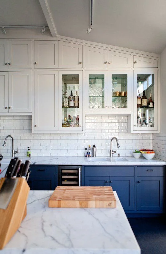
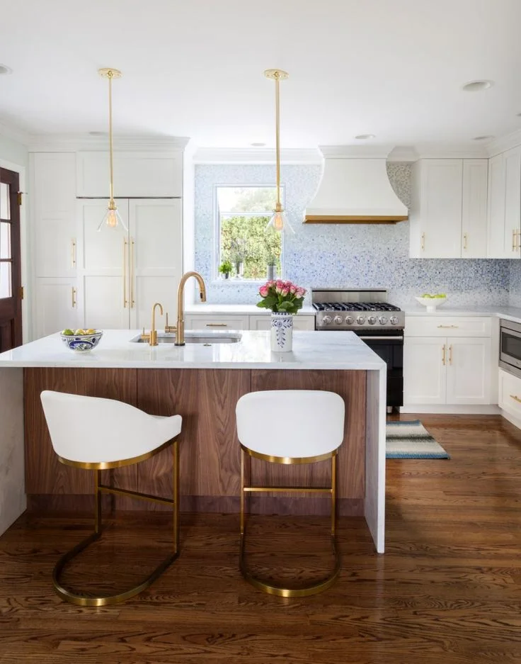
The plan! I started pinning things to my kitchens pinterest board and pretty quickly narrowed down what I wanted. I tried to keep my pins reasonable, pinning only things that would actually be helpful and not every grand, spectacular kitchen I saw. Below are a few of my favourites and what I pulled from each for our plan:
Blue :: Navy blue bottom cabinetry, white uppers and light countertops. I've really enjoyed the grey and white colour scheme of our current kitchen, but didn't want to go to all the trouble and expense of a kitchen redesign only to be left with a space that looked very much the same. Plus, we're a young family, we should have a fun space that reflects our personality! Our lower cabinets have all been spray lacquered navy blue and they look awesome!
Gold hardware :: We're replacing all the hardware in the kitchen with statement making, simple profile, gold handles (You can see a sneak peek of the ones we chose and already installed on our new pantry here). Gold hardware is kind of having a moment right now, the look may become dated sooner than later, but it's a very easy and inexpensive fix should we get tired of the look in a few years.
Wood :: we'll be adding a peninsula with bar seating and will clad the back of the cabinets (the section that will open up into the dining room) with wood stained to match our fireplace built ins.
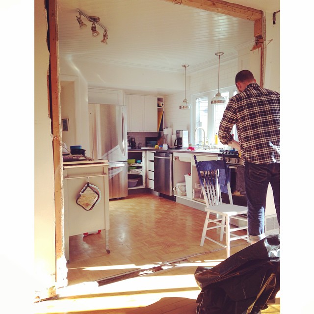
We purchased new stainless steel appliances for the kitchen last fall when they were running big sales. We tackled the troublesome pantry corner last month and were able to buy ready made pantries and custom fit them to the space with some clever use of moulding and trickery. Turns out Chris is incredibly handy. Last week we finally took the biggest step and knocked down the wall between the kitchen and dining room! Chris and my dad have finished off the opening so it's looking clean and bright and perfect. The cabinets forming the peninsula that divide the kitchen from the dining room have been installed and they measured for the new countertops yesterday!
Action shot of Chris hard at work. The wall is gone! The "in progress" view from the dining room to the kitchen.
The new "in progress" view from the kitchen to the dining room.
This has been a pretty massive undertaking. It's the first time Chris has done this much finishing work and I'm thrilled with the results. He's got such a great eye for detail. We did hire an electrician and a plumber for the jobs that were over our heads, but other than that we've done everything ourselves (and by "we" I mean that I make the plans and Chris executes them, we're a great team like that). Stay tuned for "after" shots of the finished space soon-ish. I expect the baby to arrive before the countertops do. And then there will likely be a bit of a delay before we can tackle all the last little details since we'll be a little preoccupied. But man is it ever exciting to see this space develop.


